Visualization Library: DivePort
Stamps

DivePort

ProDiver
DiveTab
Dashboards
DivePort (63): Charts + Maps + Indicators
Areas (6)

DivePort
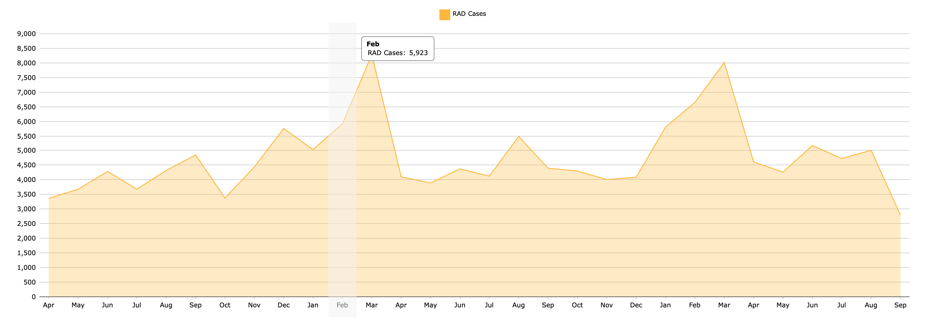
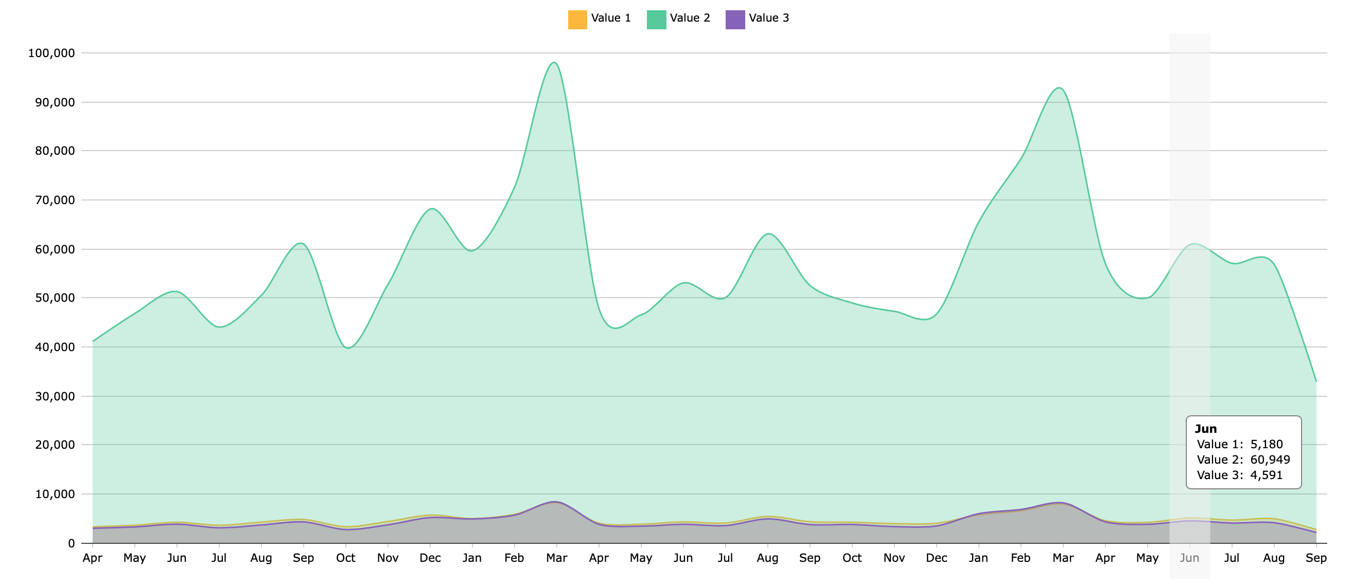
Area Chart
An Area Chart draws straight lines between data points.
Spline Area Chart
A Spline Area Chart draws curved lines between data points.
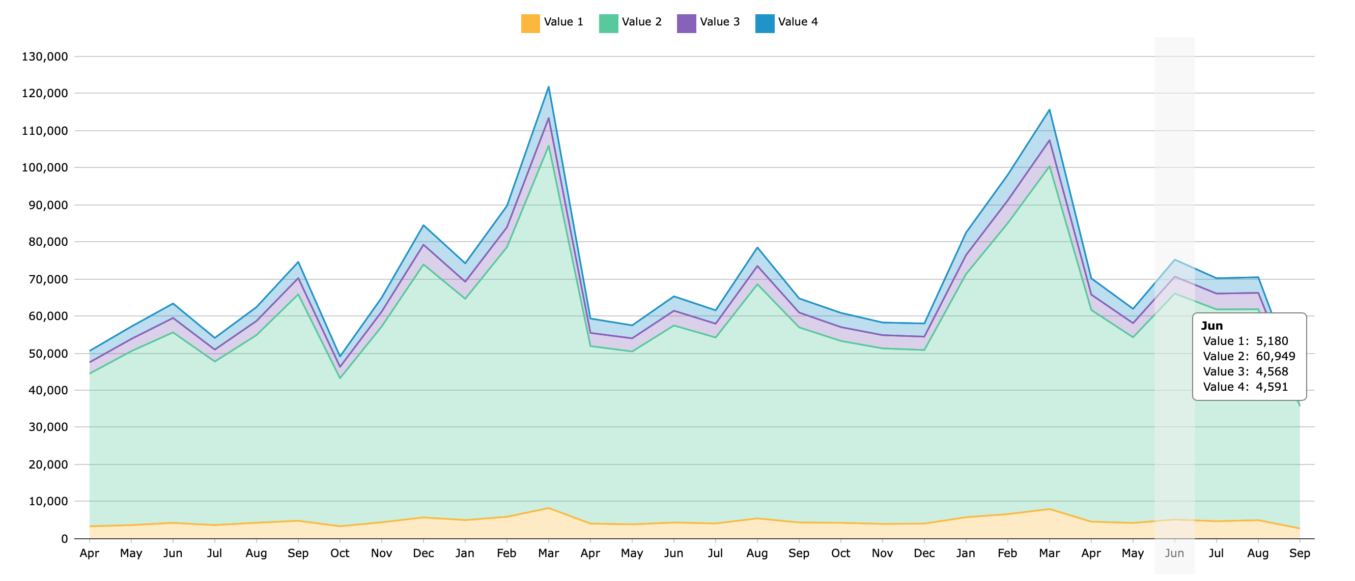
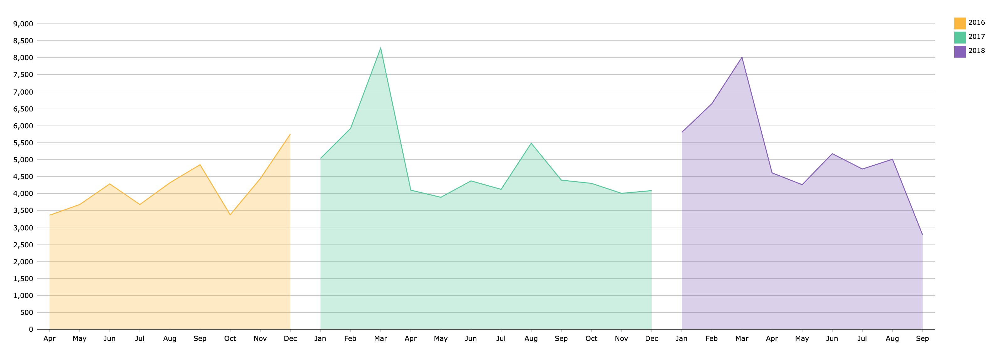
Stacked Area Chart
A Stacked Area Chart show stacks areas on top of each other, visualizing change in composition or sum total.
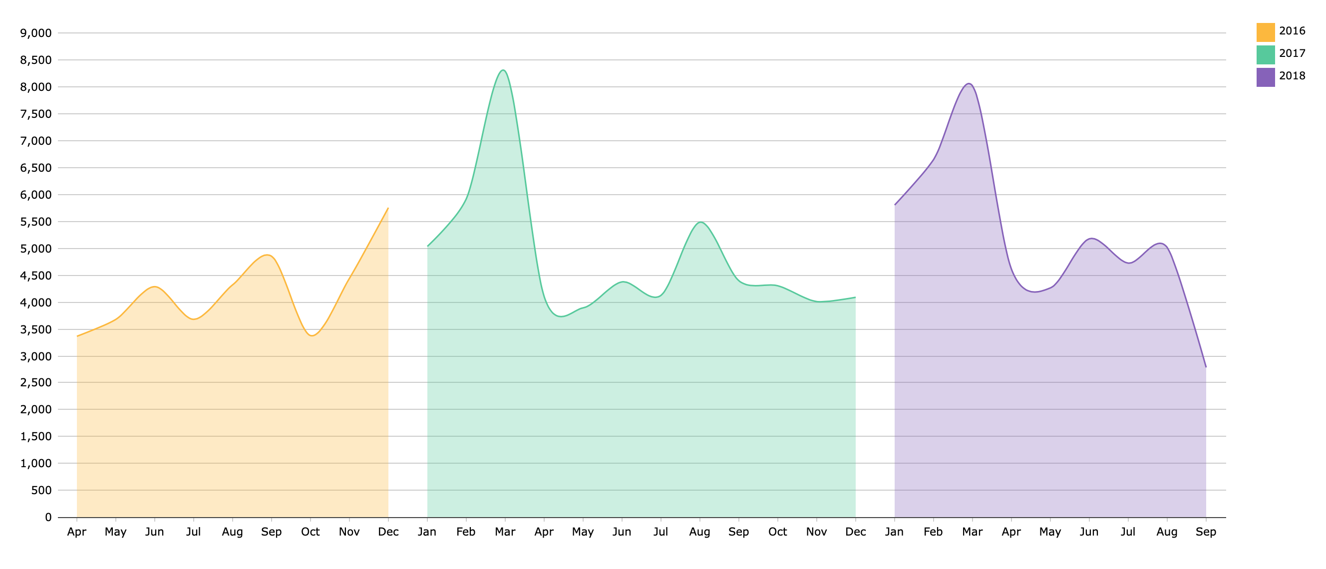
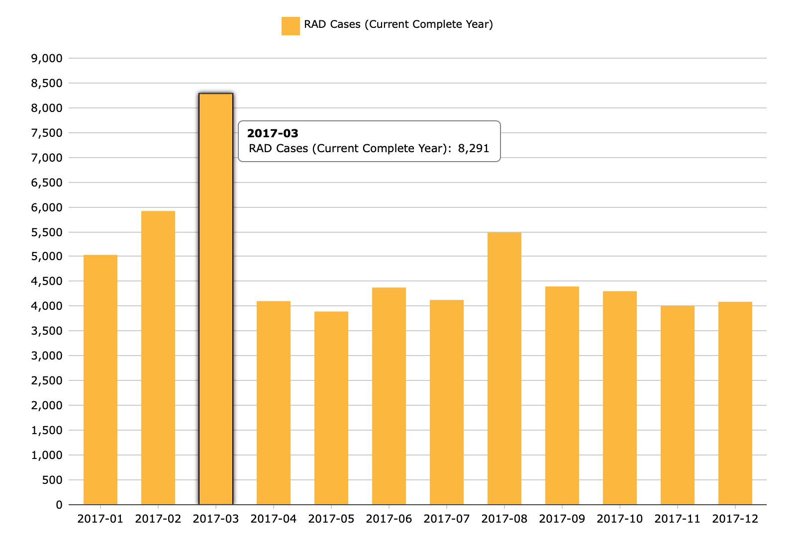
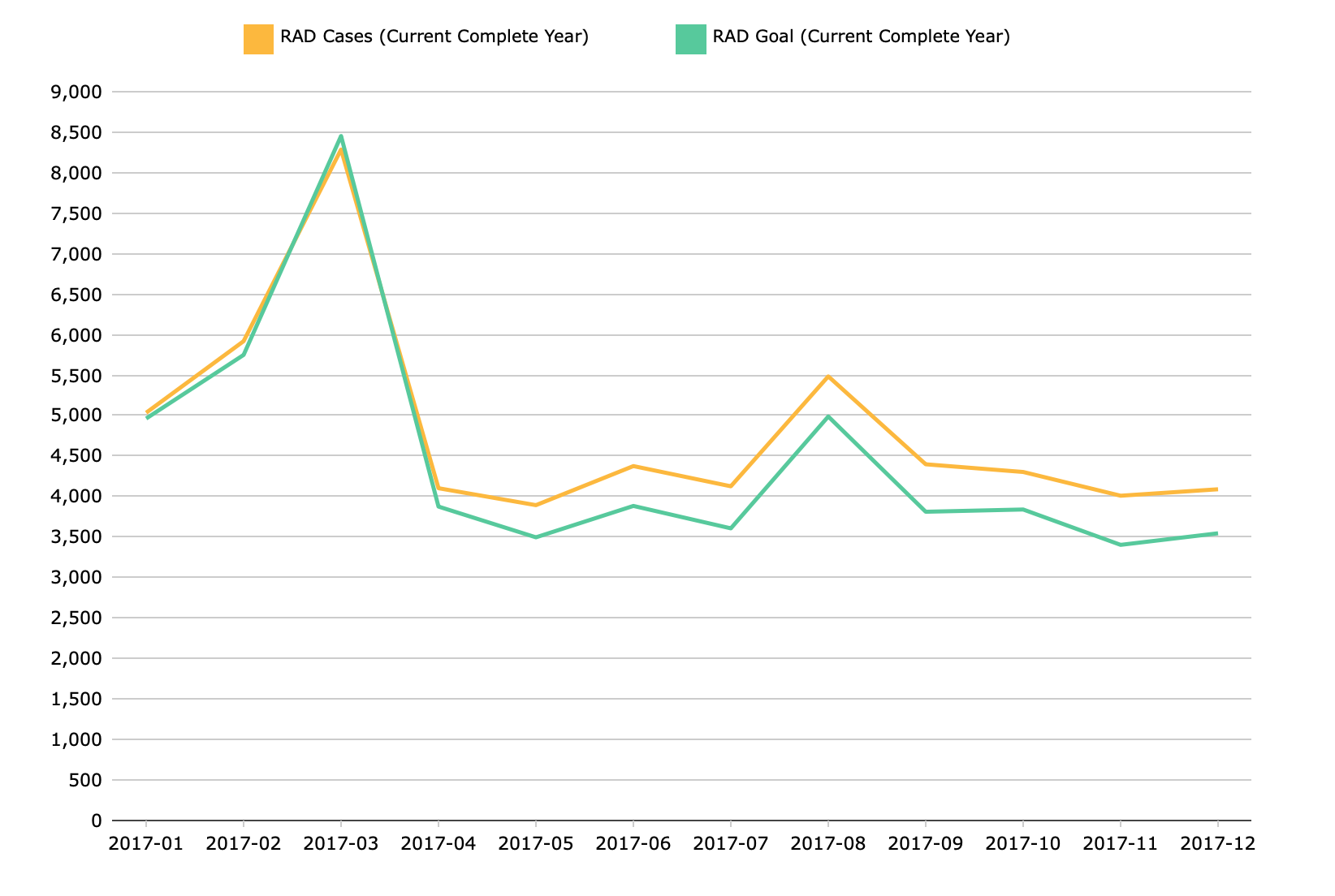
MultiTab Area Chart
A Multitab Area Chart shows an aggregate of values.
MultiTab Spline Area Chart
A Multitab Area Chart shows an aggregate of values.
MultiTab Stacked Area Chart
A Multitab Area Chart shows an aggregate of values.
Bars (11)


DivePort
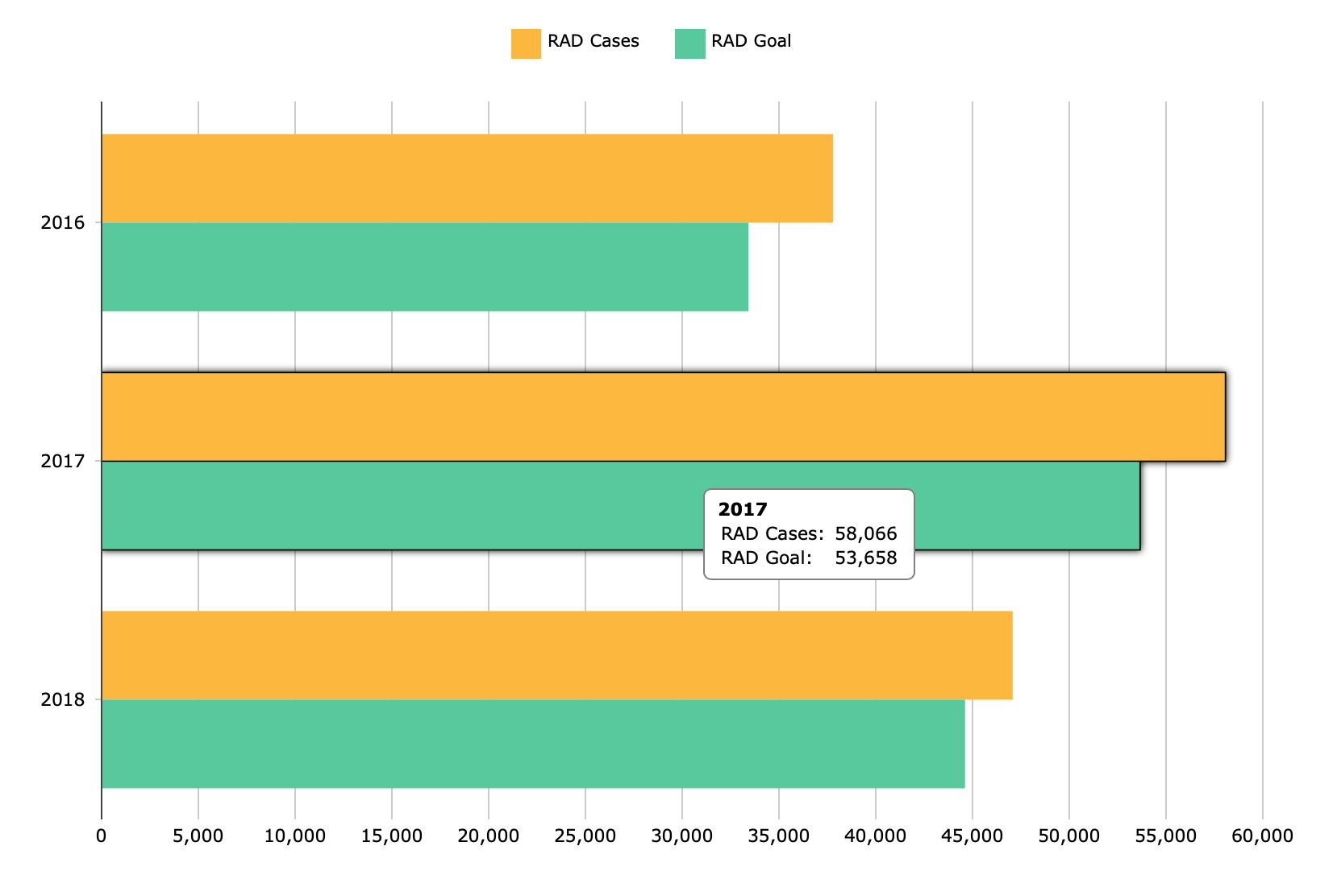
Bar Chart
A Bar Chart displays data as horizontal bars.
Bar Charts →
Column Chart
A Column Chart displays data as vertical bars.
Bar Charts →
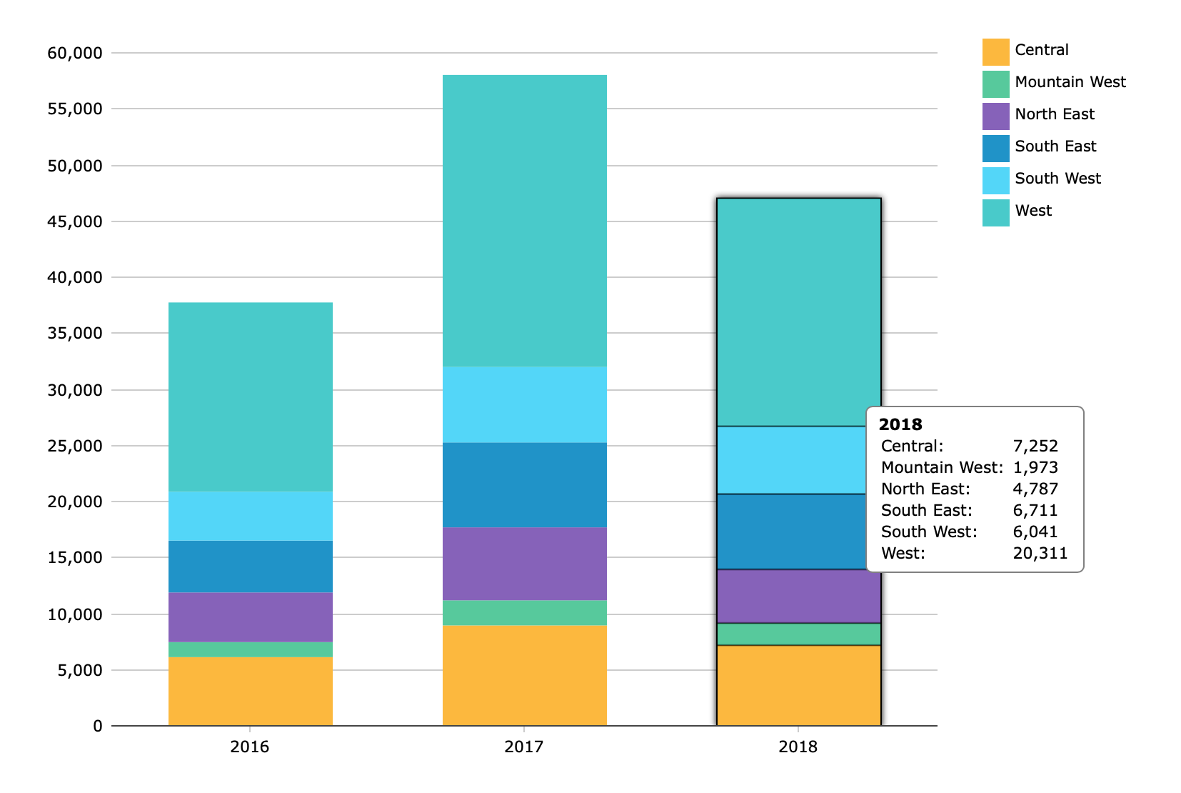
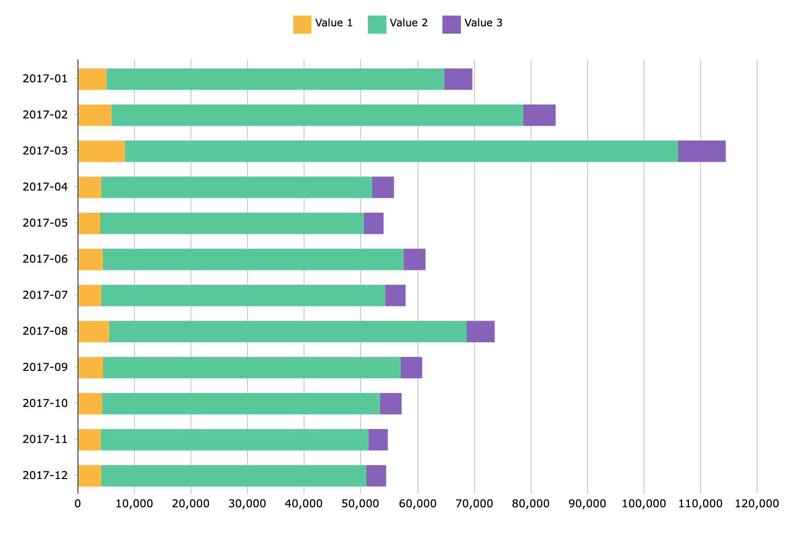
Stacked Bar Chart
A Stacked Bar Chart or Stacked Column Chart stacks values together, visualizing composition and sum total.
Stacked Data Charts →
Stacked Column Chart
A Stacked Bar Chart or Stacked Column Chart stacks values together, visualizing composition and sum total.
Stacked Data Charts →
Histogram
A Histogram Chart displays the distribution of numeric data across several dimension values.
Histogram →
MultiTab Bar Chart
A MultiTab Bar Chart displays data as horizontal bars.
MultiTab Charts →
MultiTab Column Chart
A MultiTab Column Chart displays data as vertical bars.
MultiTab Charts →
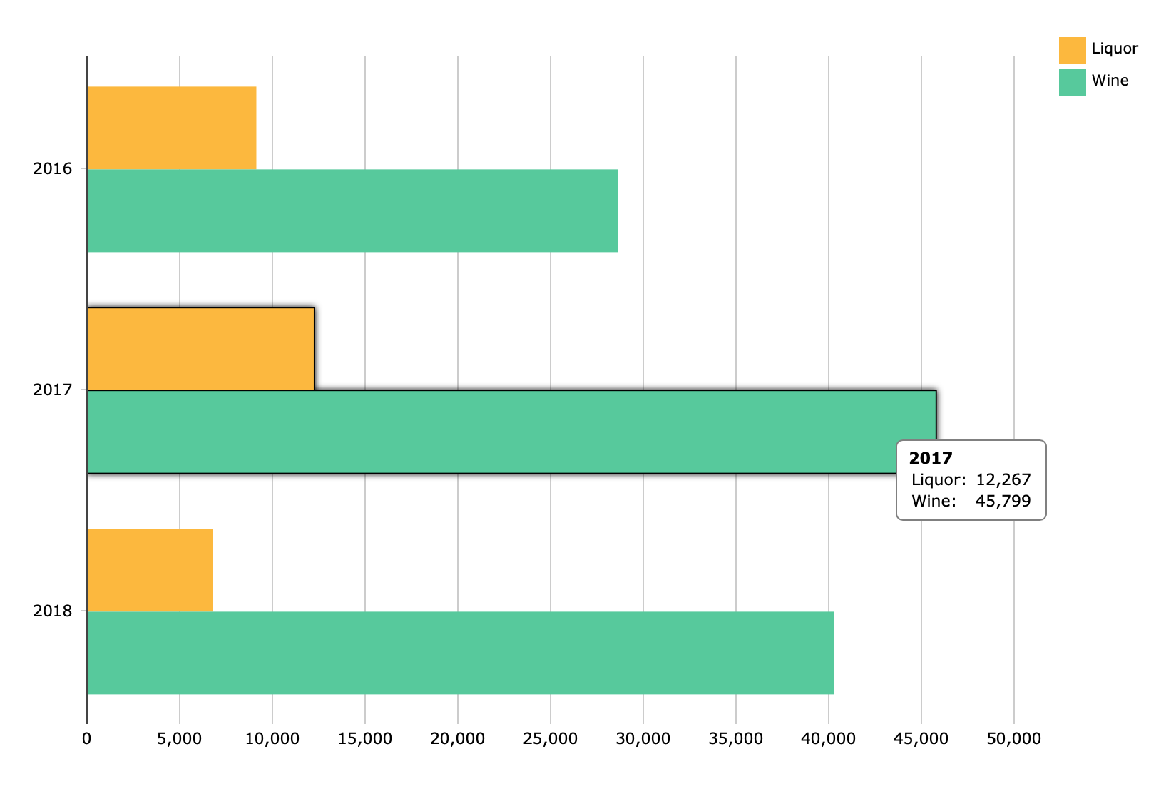
MultiTab Stacked Bar Chart
A MultiTab Stacked Bar Chart show stacks horizontal bars on top of each other, visualizing change in composition or sum total.
Stacked Data Charts →
MultiTab Charts →
MultiTab Stacked Column Chart
A MultiTab Stacked Bar Chart show stacks vertical bars on top of each other, visualizing change in composition or sum total.
Stacked Data Charts →
MultiTab Charts →
Sparkcolumn Chart
A Sparkcolumn Chart is a simplified column chart without labels or axes. It is ideal for small multiples or finding trends at a glance.
Sparkcolumn Chart →
Waterfall Chart
A Waterfall Chart displays rectangles that represent the change in a single value, rather than the magnitude of the value.
Waterfall Chart →
Connection (2)

DivePort
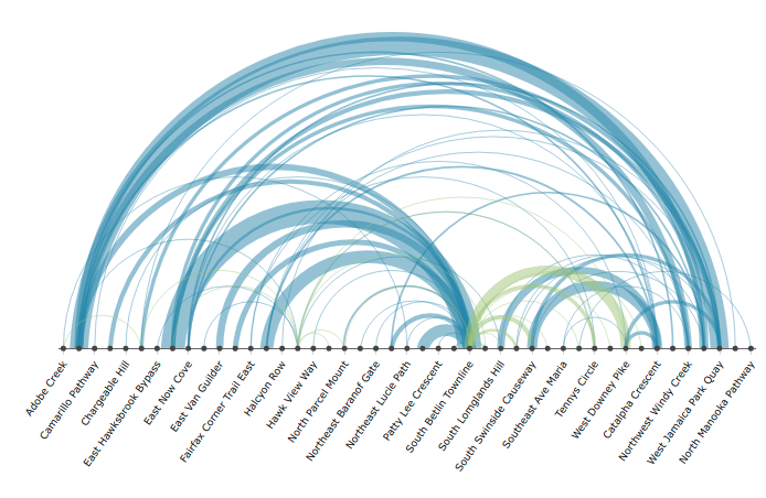
Arc Chart
An Arc Chart displays nodes on an axis and arcs connecting the nodes:
The height of an arc is proportional to the distance between its source and target nodes.
The color of an arc indicates the direction of the connection; that is, which connected node is the source and which is the target.
The thickness of an arc line is indicates represents the magnitude of a single value for that connection.
About Arc Charts →
Chord Chart
A Chord Chart displays segments around a circle, one for each dimension value, and chords connecting the segments. The thickness of a chord at each end represents the magnitude of a single value where the attached segment is the target. The color of a chord corresponds to the connected segment with the greater output, that is, the greater value where that segment is the source.
Heatmatrix (2)
DivePort
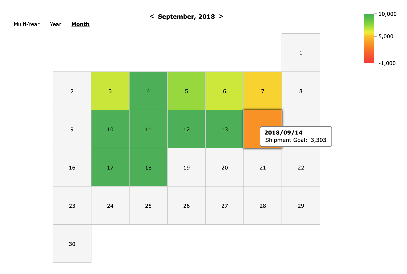
Calendar Heatmatrix
A Calendar Heatmatrix displays a single dimension whose daily values display as colors on a calendar.
About Calendar Heatmatrix Charts→
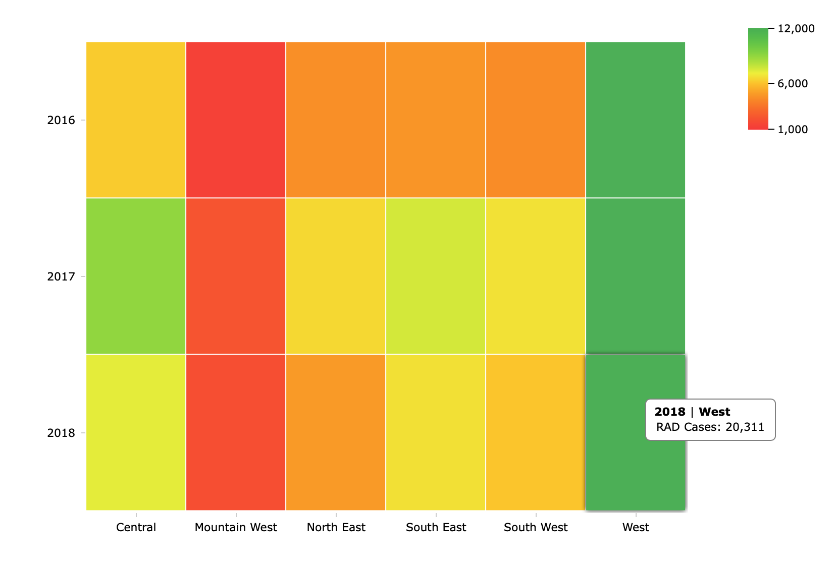
MultiTab Heatmatrix
A Heatmatrix uses a color scale to represent a single value for each cell of a matrix.
About Heatmatrix Charts→
Indicators (20)


DivePort
Bar Indicators
Horizontal Bullet
A horizontal bar chart containing threshold and target values. Use bullets to display summaries that have multiple meaningful values. For example, trends over time, relative standing within a group, or a metric with multiple targets.
About Bullet Indicators →
Vertical Bullet
A vertical bar chart containing threshold and target values. Use bullets to display summaries that have multiple meaningful values. For example, trends over time, relative standing within a group, or a metric with multiple targets.
About Bullet Indicators →
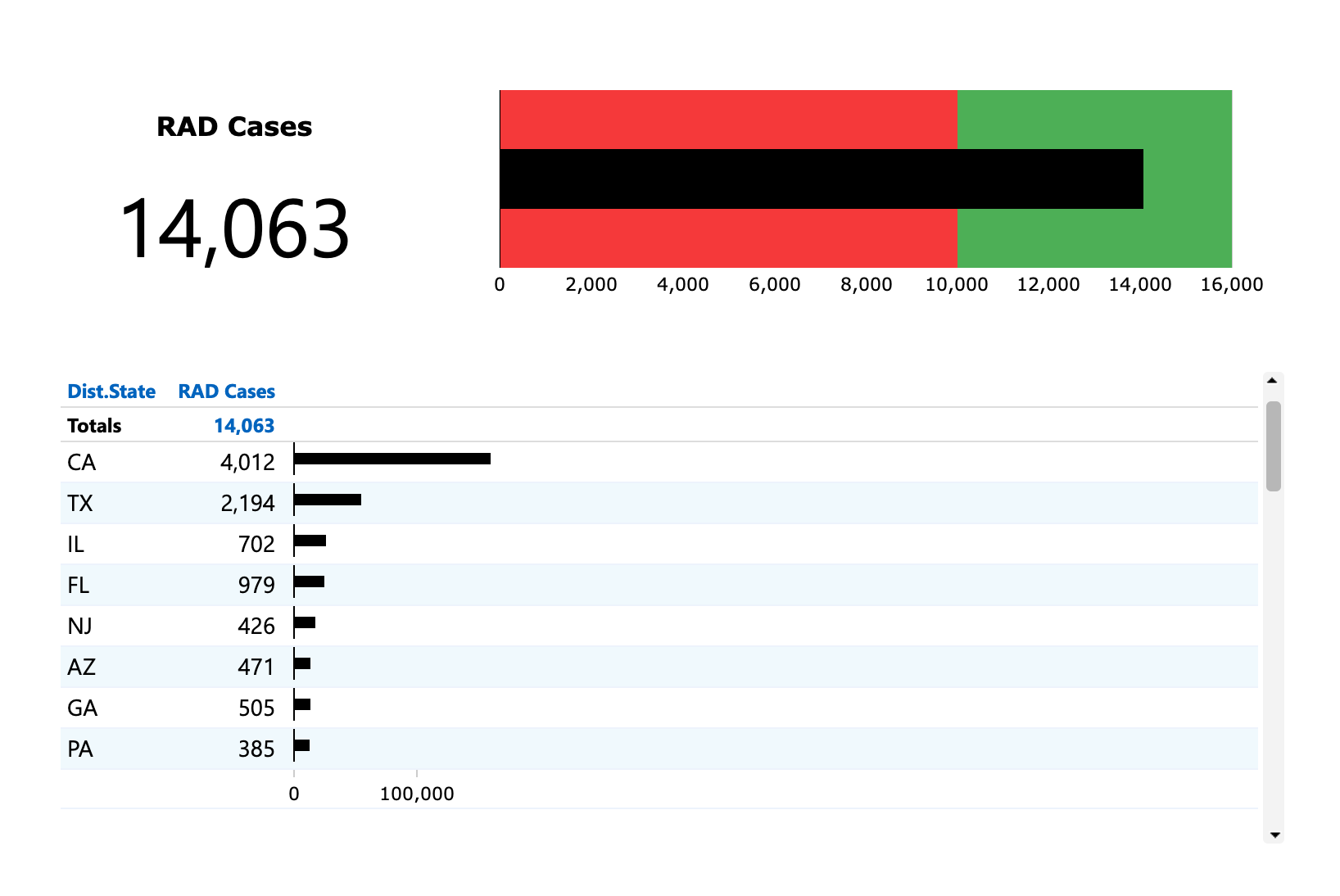
Plus-Minus
A horizontal bar chart that displays values to the left (below) and to the right (above) of a designated baseline. Use plus-minus indicators to display values with a single baseline where the amount by which you exceed or fail to meet the value is important.
About Plus-Minus Indicators →
Vertical Plus-Minus

A vertical bar chart that displays values to the above or below a designated baseline.
About Plus-Minus Indicators →
Gauges
Circular Gauge
A circular numeric scale that indicates values in terms of percentage. Use a circular gauge with single unit data to indicate progress or activity.
About Gauge Indicators →
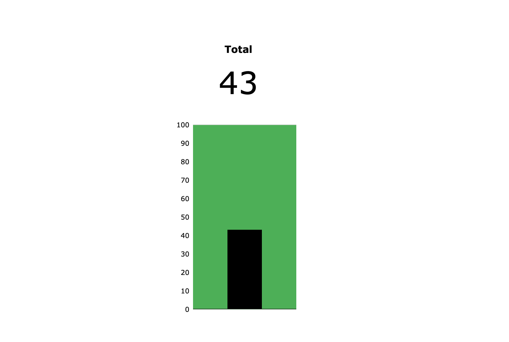
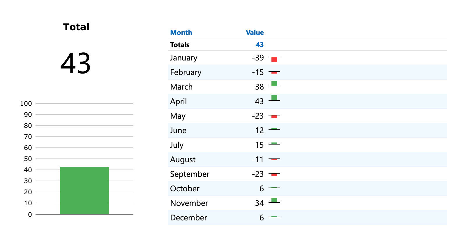
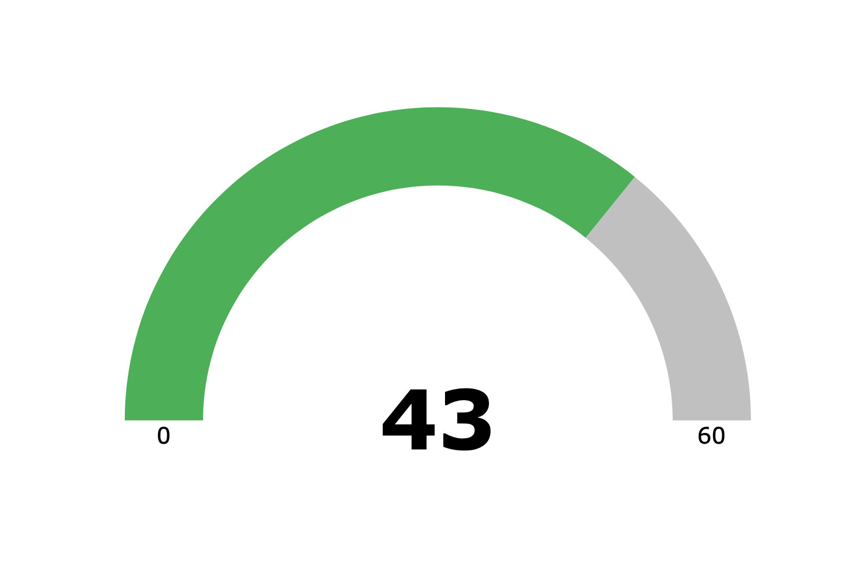
Fill Gauge
An arc that indicates values in terms of percentage. Use a fill gauge with single unit data to indicate progress or activity.
About Gauge Indicators →
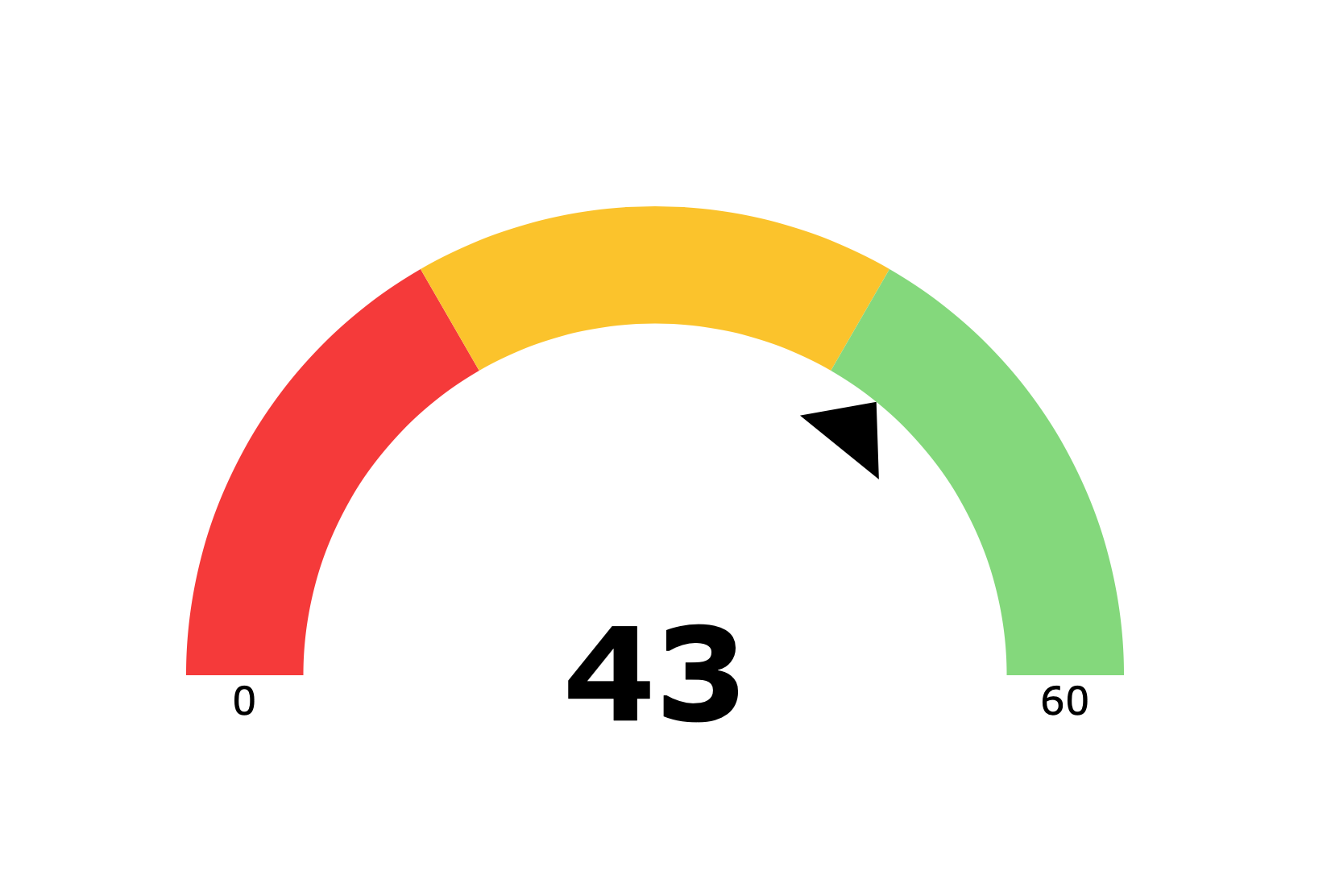
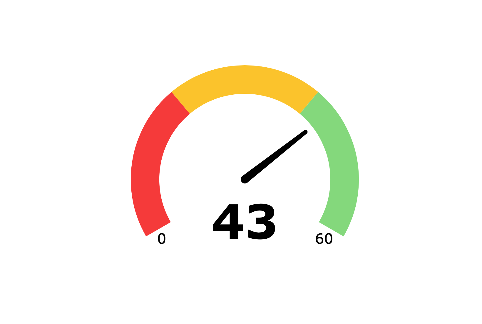
Gauge
A 180° arc with colored performance thresholds and a needle or arrow to indicate in where in the scale the value falls. Use gauges when three ranges are needed. For example, unacceptable, acceptable, and exceptional, and you want to use a scale other than the threshold values.
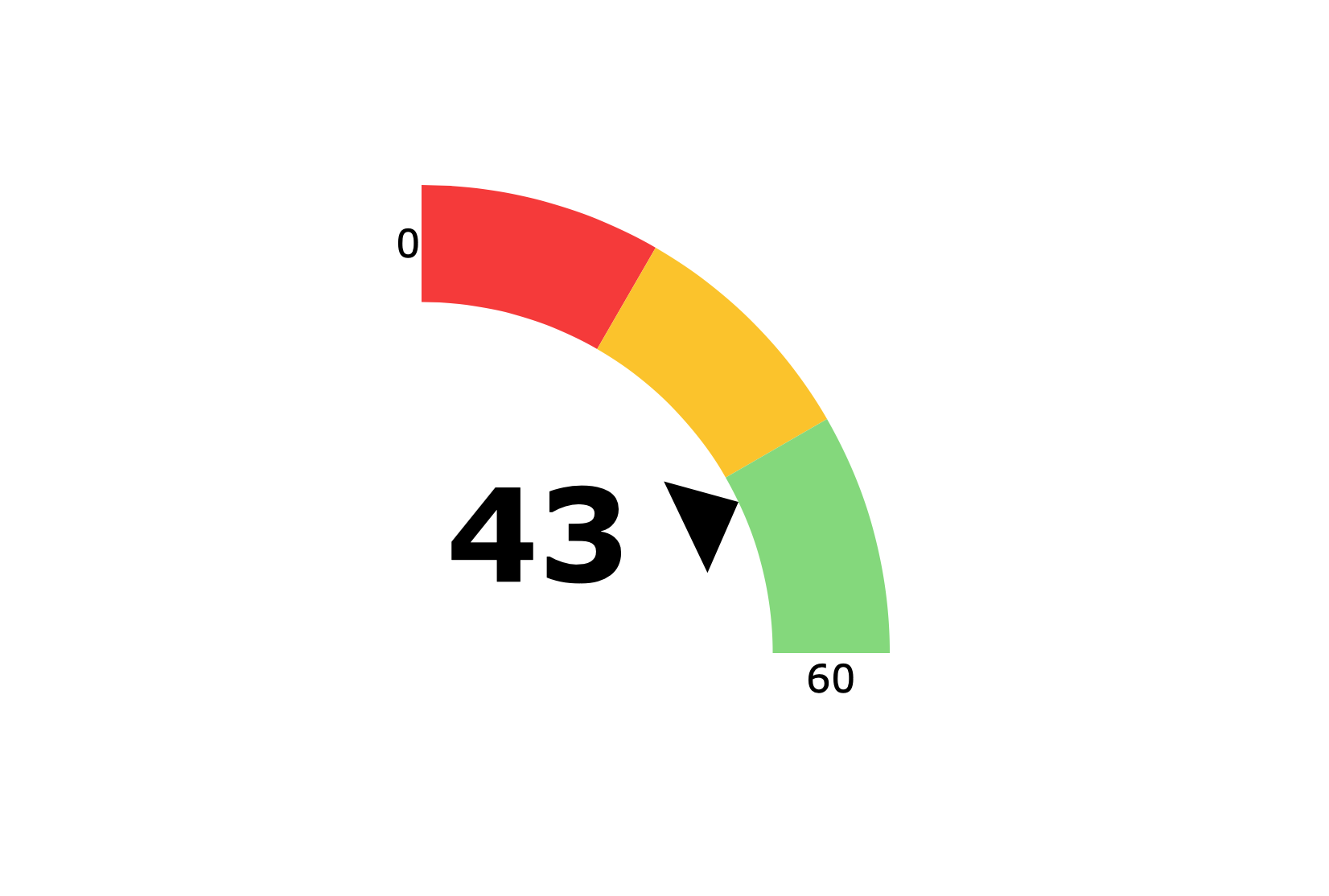
Half Gauge (Left)
A 90° arc with colored performance thresholds and an arrow to indicate where in the scale the value falls.
About Gauge Indicators →
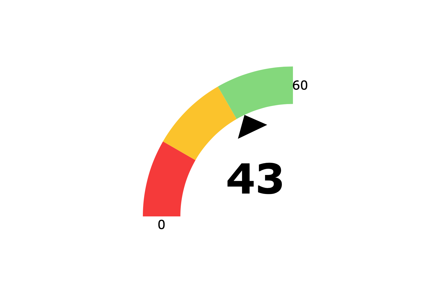
Half Gauge (Right)
A 90° arc with colored performance thresholds and an arrow to indicate where in the scale the value falls.
About Gauge Indicators →
Speedometer
A 240° arc with colored performance thresholds and a needle to indicate where in the scale the value falls.
About Gauge Indicators →
Sliders
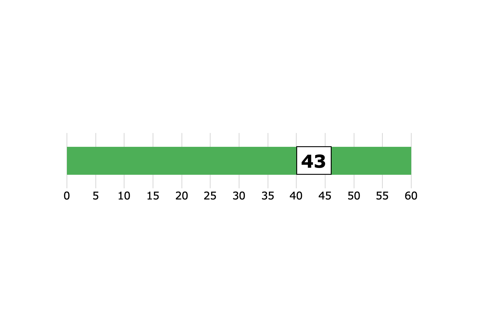
Slider
A box containing the data value is displayed on a left-to-right track. The position of the data box is relative to the numbers at each end of the track. Use the slider when you want to indicate the value position in a range to provide context to a number of values.
About Slider Indicators →
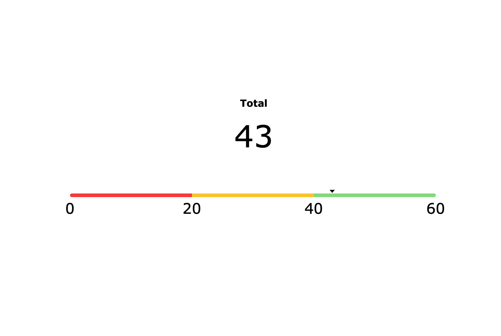
Slider Light
A thick line with an arrow that shows the data value relative to thresholds.
About Slider Indicators →
Vertical Slider
A box containing the data value is displayed on a vertical track. The position of the data box is relative to the numbers at each end of the track. Use the slider when you want to indicate the value position in a range to provide context to a number of values.
About Slider Indicators →
Racetrack
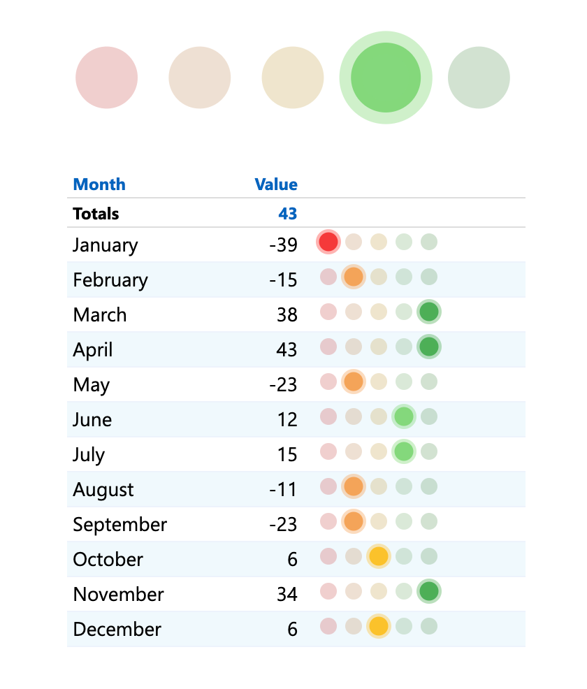
A set of two to five colored circles indicating where a value falls within a set of threshold ranges. Use racetrack indicators to provide context to the values displayed.
About Slider Indicators →
Vertical Racetrack
A set of two to five lights indicating where a value falls within a set of threshold ranges. Use racetracks to provide context to the data displayed.
About Slider Indicators →
Shape Indicators
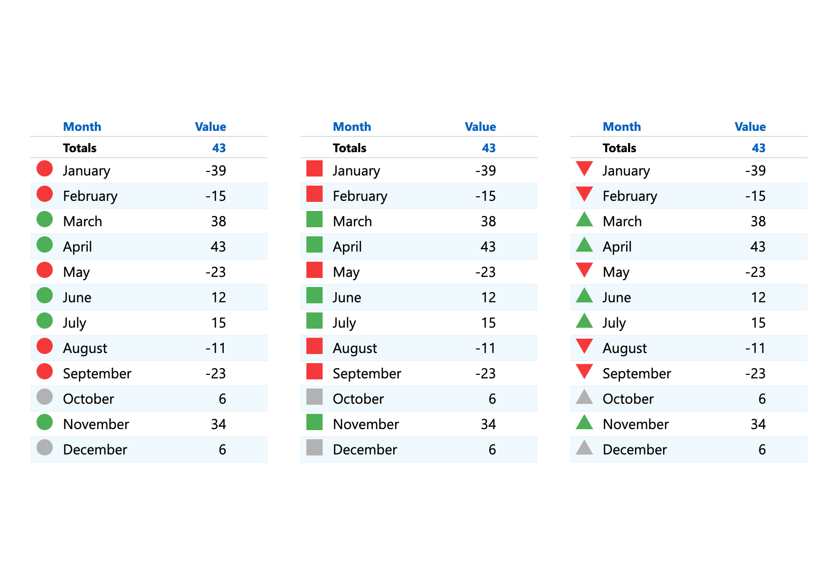
Alert
A single shape that changes color based on whether the value is above or below specified thresholds. You can choose a circle, square, triangle, or arrow shape for the alert. Use alerts to provide context to data on a tabular display or as free standing portlets.
About Alert Indicators →
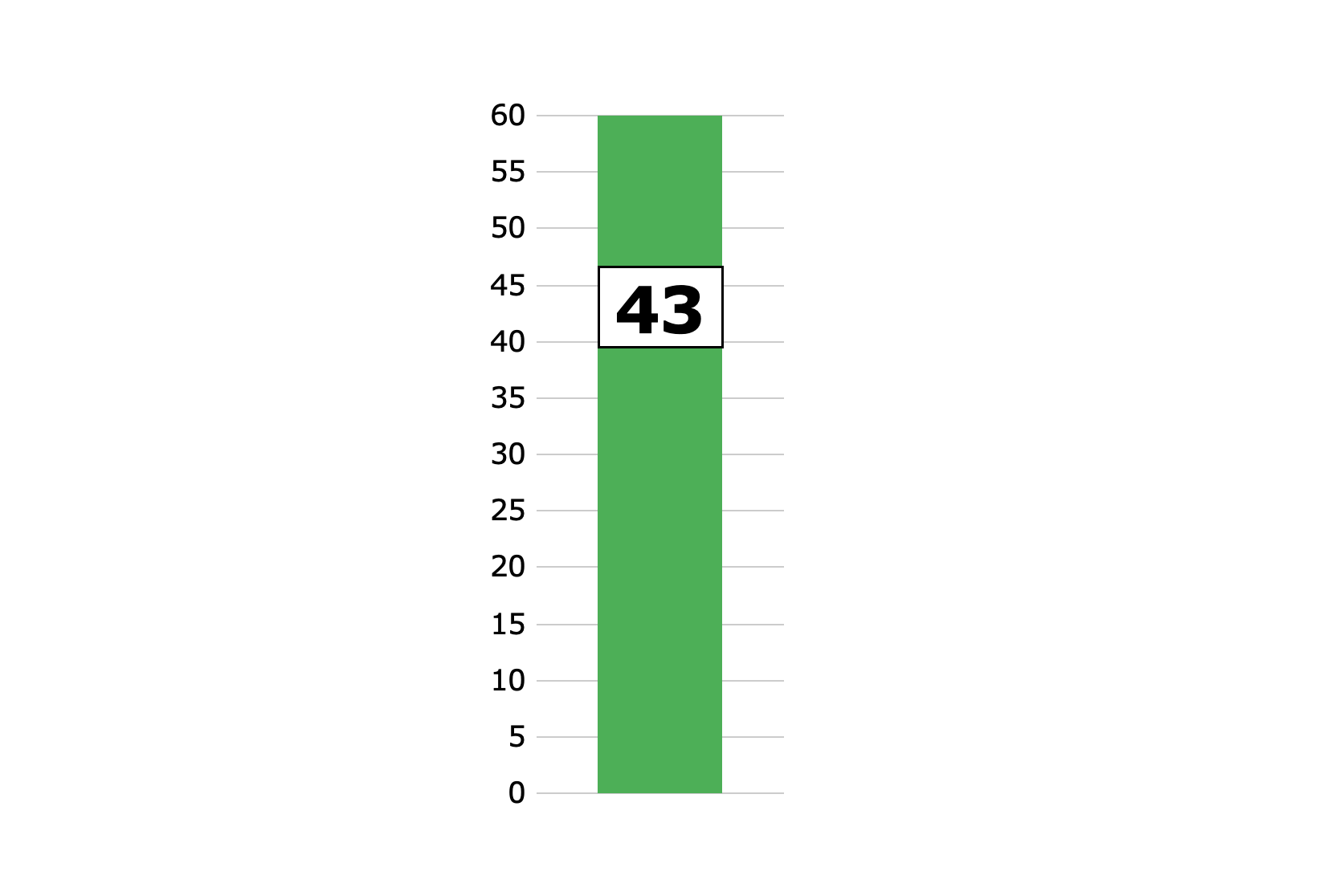
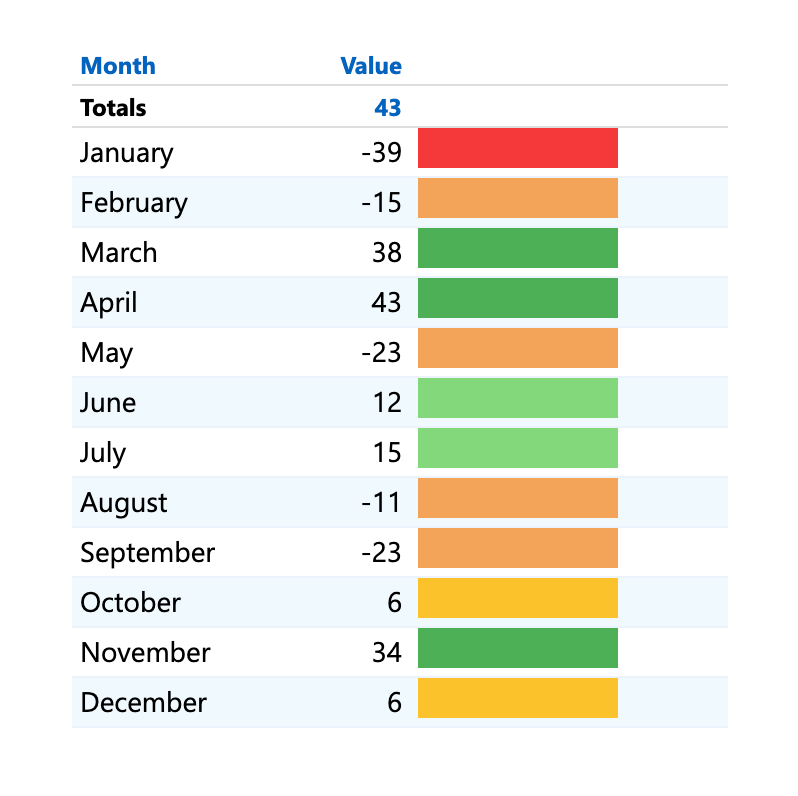
Rectangle
A single rectangular shape with customizable visual elements that change based on various thresholds. Use rectangles when you want to display thresholds for different summary values at the same time.
About Rectangle Indicators →
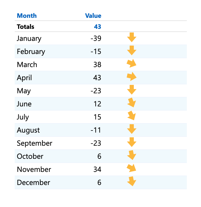
Slope
A right-pointing arrow that changes direction based on changes over time, with no change pointing right and all other values pointing up or down at an angle (depending on whether the change in value is positive or negative). Use the slope when the direction of change over time is the only element that matters.
About Slope Indicators →
Basic Indicators
Image
A designated set of images you can use to display up to four thresholds. Link each range to a different image. You can upload custom image sets.
About Image Indicators →
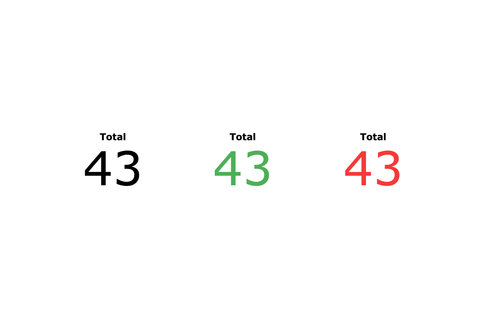
Text
An alphanumeric string that is colored to indicate its value’s relationship to the thresholds. Use the text indicator to indicate a value’s acceptability without added graphics.
NOTE: No data and null values appear as “- -“
About Text Indicators →
Lines and Points (8)


DivePort
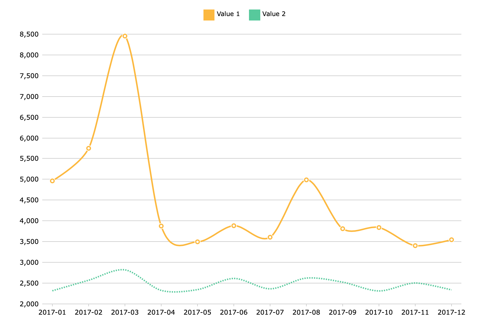
Line Chart
A Line Chart draws straight lines between data points.
Spline Chart
A Spline Chart draws curved lines between data points.
Scatter Plot
A Scatter Plot displays the relationship between two values. Scatter plots are best for visualizing correlation between variables, the clustering or distribution of data, or anomalies and outliers.
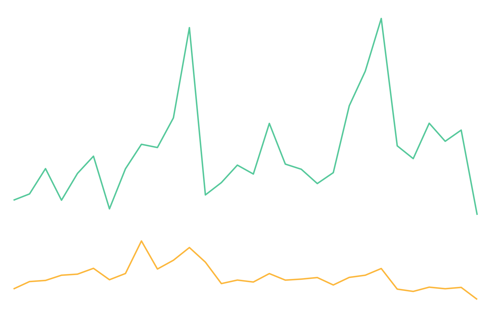
Sparkline
A Sparkline Chart is a simplified line chart without labels or axes. They are ideal for small multiples or finding trends at a glance.
MultiTab Line Chart
A Line Chart draws straight lines between data points.
MultiTab Spline Chart
A Spline Chart draws curved lines between data points.
MultiTab Sparkline
A Sparkline Chart is a simplified line chart without labels or axes. They are ideal for small multiples or finding trends at a glance.
Stringline Chart

A Stringline Chart is a variant of a MultiTab Line Chart that displays multiple values sliced by a second dimension, called a category. Commonly used to visualize timing of public transit routes, stringline charts are best for showing groups of processes that progress through a series of checkpoints.
Finance (2)

DivePort
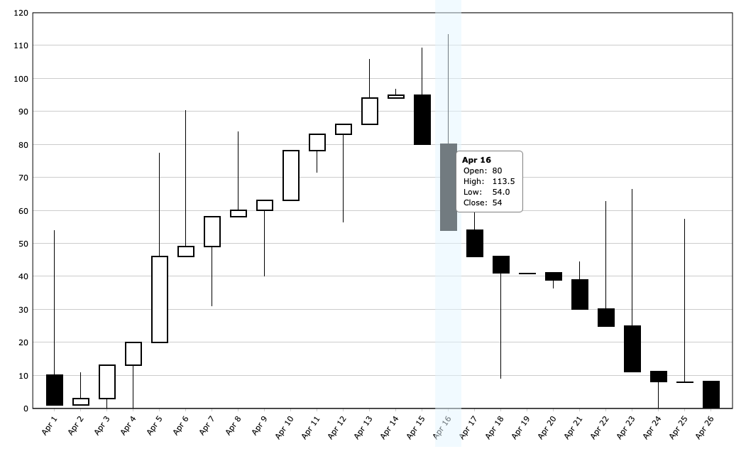
Candlestick Chart
A Candlestick Chart displays boxes with edges at the open and close values and lines with endpoints at the high and low values. The color of a box represents the direction of movement from open to close: up (white) or down (black).
Open-High-Low-Close
An Open-High-Low-Close Chart displays vertical lines with endpoints at the high and low values. To the left of each vertical line is a tick mark representing the open value, and to the right another tick mark representing the close value. The color of each line represents the direction of movement from open to close: up (green) or down (red).
Maps (4)

DivePort
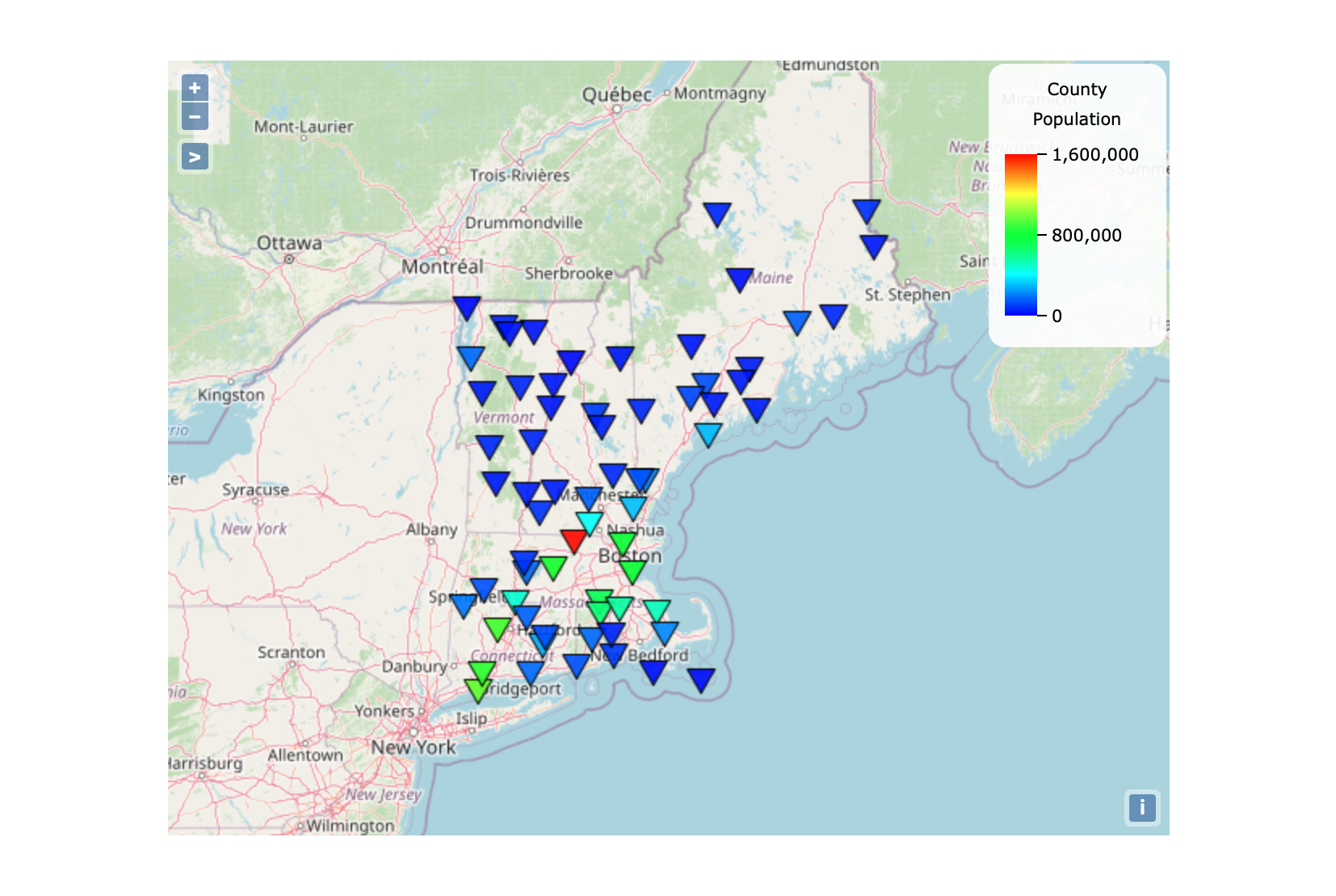
Boundary Map
Boundary maps use country, province, state, county, or postal code data. Predefined regions of the map are color-coded according to the data summarized over a region.
Boundary map →
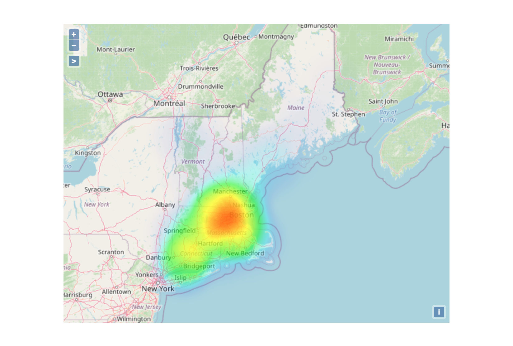
Heat Map
Heat maps use longitude and latitude coordinates to show data concentration using colors.
Heat map →
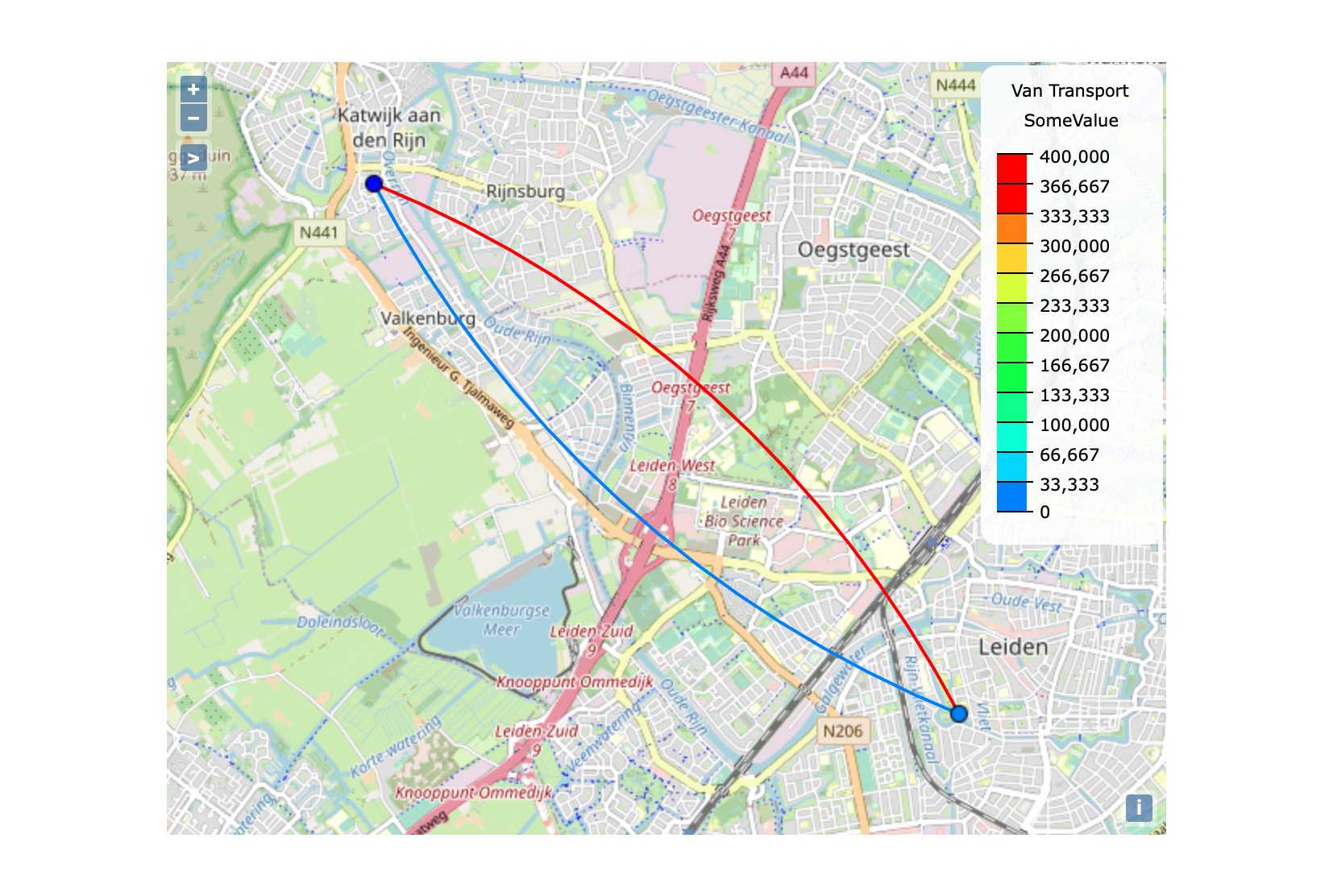
Line Map
Line maps use longitude and latitude coordinates to show origin-destination data by drawing lines on a map.
Line map →
Point Map
Point maps use longitude and latitude coordinates to show data points. Summarized data concentration is shown using color or sizing of the data points.
Multi-type (2)


DivePort
Combination Chart
A Combination Chart displays multiple values as superimposed Area, Column, Line, Spline, or Spline Area charts.
Trellis Chart
A Trellis Chart displays a CrossPlot, where one chart is split into subcharts based on a second dimension called a category. Several subchart types are available, such as bar, column, line, and area.
Pies (2)


DivePort
Pie Chart
A pie chart displays values of a single dimension as wedges. By default, they display up to 12 values. If there are more than 12 values, the chart displays the first 11 values, and combines the remaining values in a 12th wedge called Other. They are best for visualizing percent composition or part-to-whole relationships.
Donut Chart
A donut chart displays values of a single dimension as wedges. By default, they display up to 12 values. If there are more than 12 values, the chart displays the first 11 values, and combines the remaining values in a 12th wedge called Other. They are best for visualizing percent composition or part-to-whole relationships.
Statistics (2)
DivePort
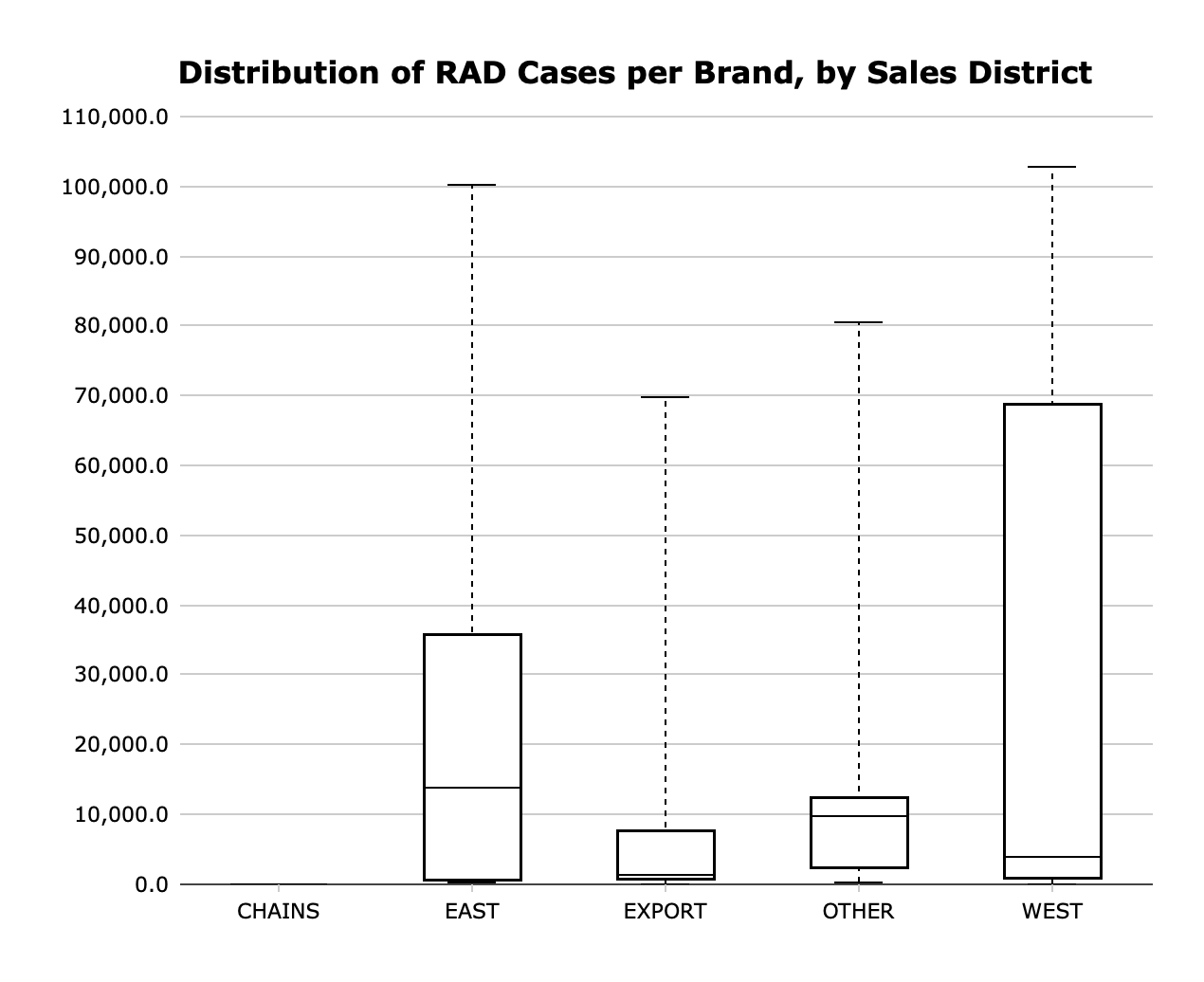
Box Plot
A Box Plot or a Horizontal Box Plot displays the minimum, maximum, median, and first and third quartiles of a distribution for each dimension value. It can also show outliers.
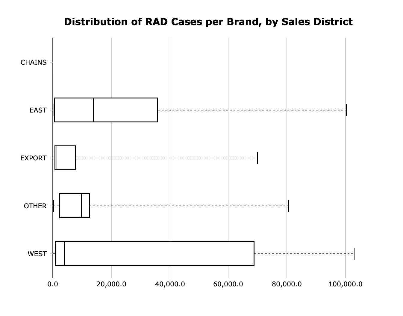
Horizontal Box Plot
A Box Plot or a Horizontal Box Plot displays the minimum, maximum, median, and first and third quartiles of a distribution for each dimension value. It can also show outliers.
Tiles (2)
DivePort
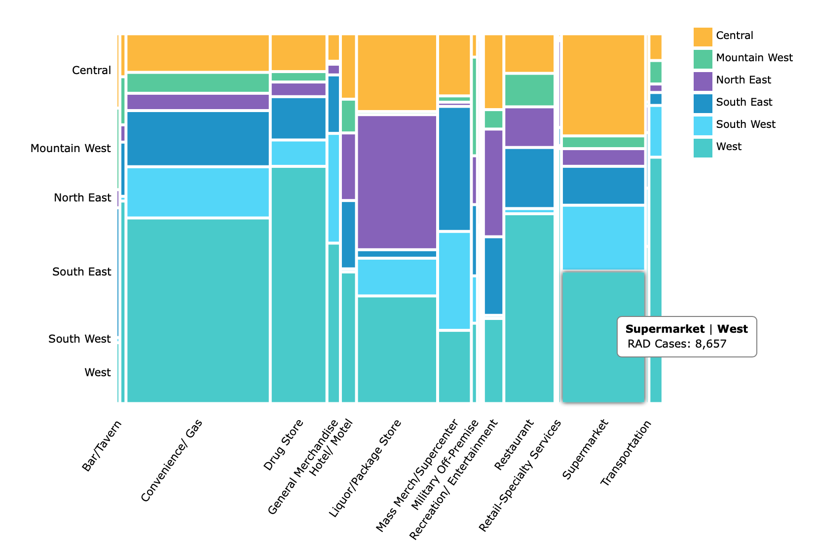
Mosaic Chart
A Mosaic Chart displays tiles in a matrix, where the size of each tile is determined by the magnitude of a single value.
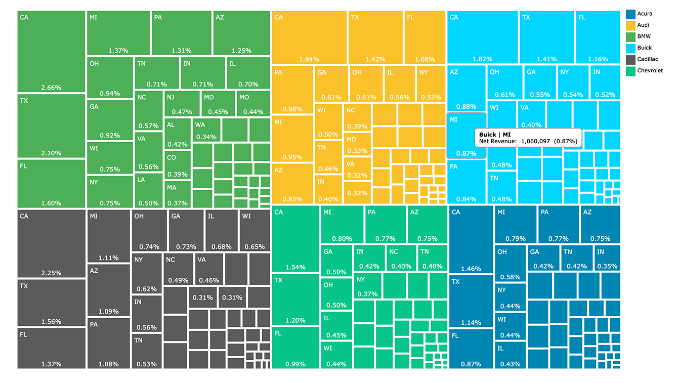
Treemap
A Mosaic Chart displays tiles in a matrix, where the size of each tile is determined by the magnitude of a single value.